
A portfolio with a point of view
Project pages pair photography with the original brief, design approach and spatial decisions. Related projects help visitors keep exploring work that matches their ambitions.
Architecture & interiors
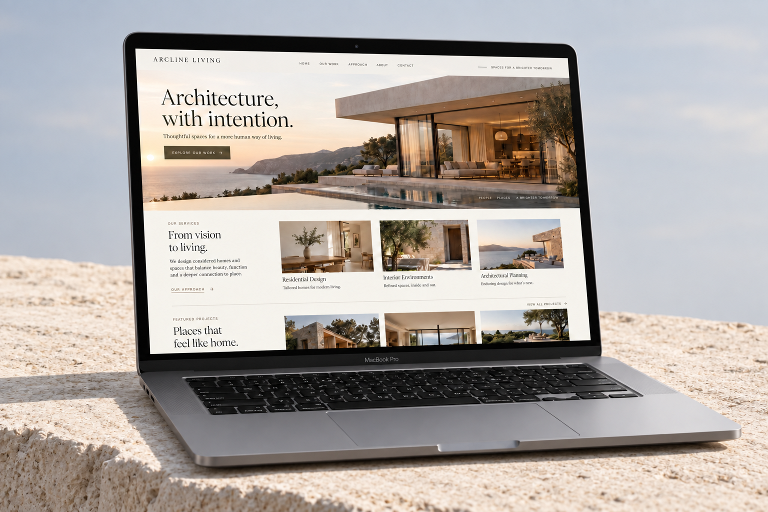
For an interiors studio, a website should communicate the same care as the spaces it creates. We brought Arcline Living’s portfolio, process and point of view together in a completely custom experience that turns browsing into a conversation.
Attract better-fit residential projects and make it easier for visitors to book an initial design consultation.
Let the work lead, explain the thinking behind it, and place a clear next step at the moments when visitors are ready to act.
THE BUSINESS
Arcline Living is an independent architecture and interiors studio working with homeowners on renovations and new residential spaces. Its strength is the relationship between practical planning, considered materials and everyday life. The website needed to communicate that attention to detail before a prospective client ever picked up the phone.
THE CHALLENGE
A collection of attractive images was not enough to explain the studio’s value. Visitors could see finished rooms, but they could not easily understand the brief, the design decisions or the kind of projects the team took on. Important questions about the process, scope and first meeting were scattered across the experience.
The main opportunity was to give inspiration a useful structure. A visitor discovering a kitchen renovation should be able to explore the wider project, understand how the studio works and start a relevant conversation without returning to the main menu.
THE APPROACH
We organised the site around three visitor questions: does this work feel right for me, can the studio help with my project, and what happens next? That led to a portfolio-first homepage, clearer service pathways and a consultation journey with practical prompts.
A warm ivory palette, architectural spacing and editorial typography created a quiet frame for the project photography. Full-width images were balanced with concise descriptions, material details and project context. The visual system stayed consistent across individual projects while giving every space room to feel different.
THE EXPERIENCE
Every part of the experience connects a business goal to a clearer next step.
Project pages pair photography with the original brief, design approach and spatial decisions. Related projects help visitors keep exploring work that matches their ambitions.
Project-specific enquiry links carry visitors toward a short brief. Budget, location and project-stage prompts make the first conversation more useful for both sides.
Responsive galleries, readable image captions and compact navigation keep the work easy to explore on a phone. Contact options remain simple to reach after a visitor views a project.
Service descriptions, descriptive page titles and location-relevant content give each page a clear purpose. The structure supports discovery without overwhelming the visual experience.
THE WEBSITE
The landing page brings the story, services and next step together in one continuous experience. Scroll through the design or open the full-size view.
Explore the full landing page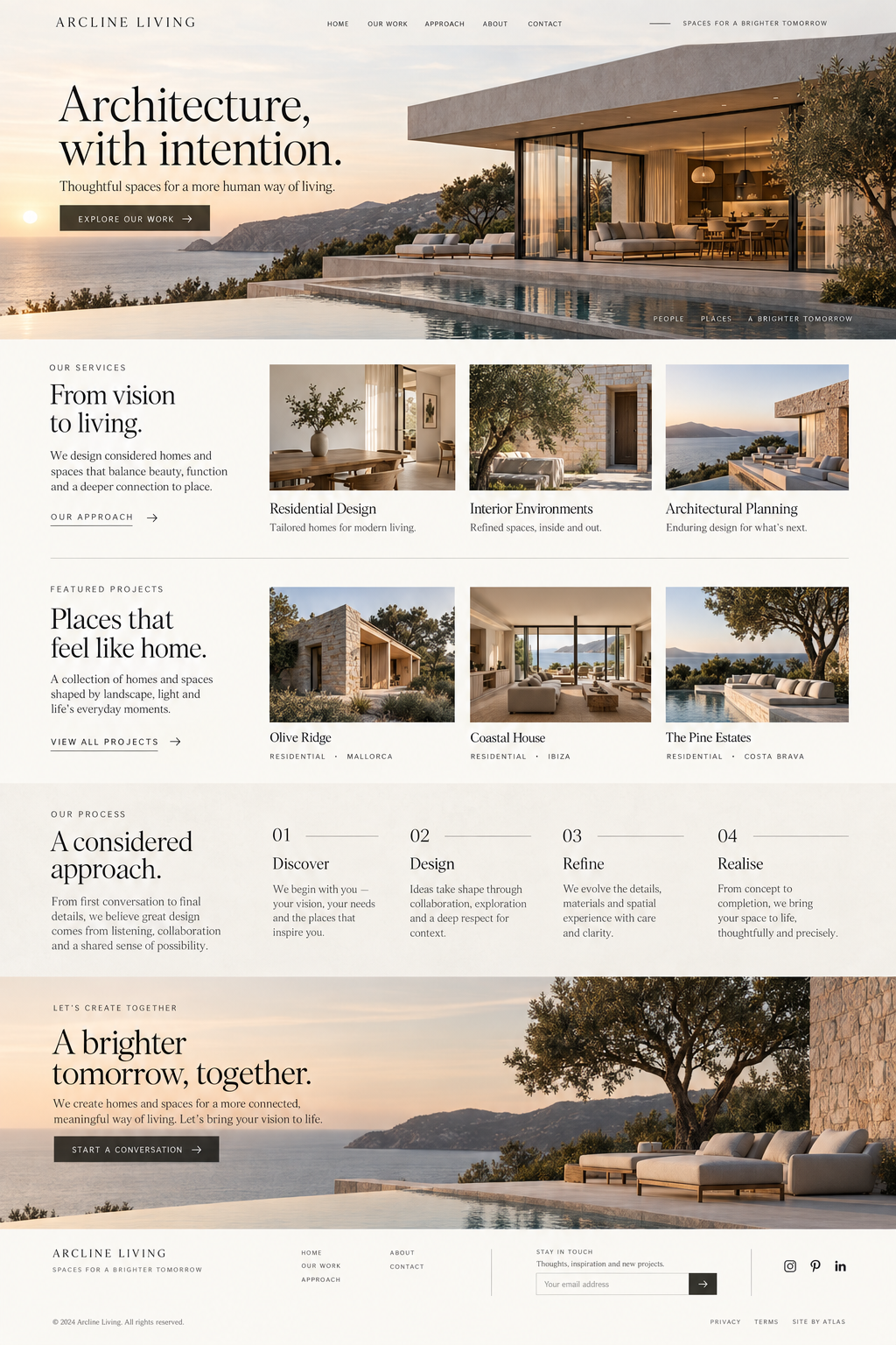
DEVELOPMENT & HANDOVER
We developed the layouts from scratch and refined how the galleries behaved at different screen sizes. Image sizing, loading order and restrained motion were considered together so the portfolio could remain visually rich without making every visit feel heavy. Keyboard navigation and descriptive links were included in the interaction design.
THE RESULTS
The clearer portfolio journey brought more visitors from project discovery to the consultation page. Enquiries increasingly referenced specific rooms, materials and services, giving the team a more useful starting point for discussing new work.
1,250 2,850 per month
25 46 per month
18 30 per month
Monthly baseline compared with the third month after launch. Figures shown use the same channel and event definitions across both periods.
CLIENT PERSPECTIVE
“We finally have a website that feels like the spaces we design. Traffic has grown, the phone is ringing more often, and the people contacting us already understand our work. The first conversation is so much better.”
YOUR BUSINESS. YOUR NEXT CHAPTER.
Let’s build