
Collections with context
Room and material-led pathways introduce products in useful combinations. Visitors can browse with a purpose or follow an editorial story into a collection.
Retail & lifestyle
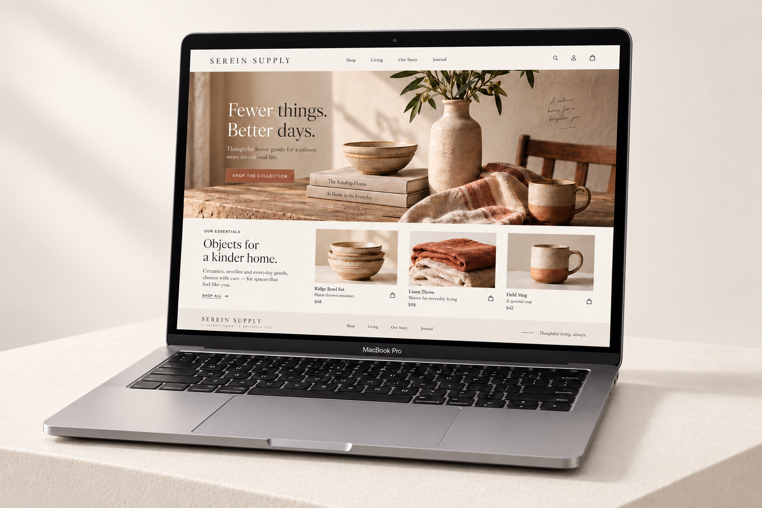
Serein Supply’s collection deserved more than a product grid. We designed a custom shopping experience that brings together careful curation, useful product information and a clear path from discovery to checkout.
Grow product discovery and online orders while preserving the brand’s considered, editorial character.
Organise the collection around how people live, give products enough context to earn a decision, and simplify the steps that follow.
THE BUSINESS
Serein Supply curates homewares and everyday objects with an emphasis on material, function and longevity. Customers are not simply shopping for another item; they are choosing objects they expect to live with. The digital experience needed to make the collection feel personal while keeping practical information close at hand.
THE CHALLENGE
The existing shopping journey presented products without enough context. Visitors could browse names and images, but material details, care information and related pieces were difficult to compare. The brand story was detached from the places where purchase decisions were being made.
The opportunity was to make the editorial and commercial parts of the website work together. Inspiration should lead naturally to a collection, and a product page should answer the questions that stand between interest and an order.
THE APPROACH
We reviewed the collection structure and built the journey around useful categories, room-based discovery and complementary products. Product-page priorities were defined around dimensions, materials, availability and care, with the brand story supporting rather than interrupting the shopping flow.
Warm whites, tactile photography and refined serif headlines gave the site a calm, considered rhythm. Product information used a more direct typographic style, making specifications easier to scan. Generous spacing and consistent image treatment helped the collection feel coherent across categories.
THE EXPERIENCE
Every part of the experience connects a business goal to a clearer next step.
Room and material-led pathways introduce products in useful combinations. Visitors can browse with a purpose or follow an editorial story into a collection.
Dimensions, materials, care and delivery information are grouped into clear sections. Related products support discovery without distracting from the primary decision.
Consistent action labels and a clear hierarchy make it easier to move from a product to the cart. On mobile, essential information appears before secondary storytelling.
Unique product descriptions, descriptive category pages and a consistent heading structure support both people browsing the site and search engines interpreting the collection.
THE WEBSITE
The landing page brings the story, services and next step together in one continuous experience. Scroll through the design or open the full-size view.
Explore the full landing page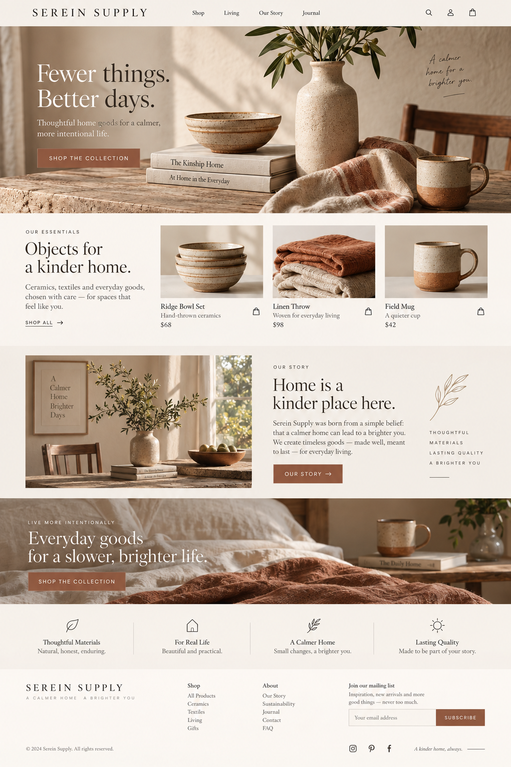
DEVELOPMENT & HANDOVER
We created a custom design system for collection cards, product information, editorial features and navigation. Responsive image handling and restrained page effects kept the shopping experience focused. The handover included patterns for presenting new products consistently as the catalogue grew.
THE RESULTS
Visitors explored more of the collection and placed more orders. Product-specific enquiries became more informed, with customers referring to materials and dimensions they had already reviewed on the website.
5,000 8,600 per month
250 370 per month
40 54 per month
Monthly baseline compared with the third month after launch. Figures shown use the same channel and event definitions across both periods.
CLIENT PERSPECTIVE
“The new website makes our collection feel considered from the first click. We are seeing more traffic and more orders, and customers arrive with a much better understanding of the products. The website finally reflects the care behind the brand.”
YOUR BUSINESS. YOUR NEXT CHAPTER.
Let’s build