
A product story with a clear sequence
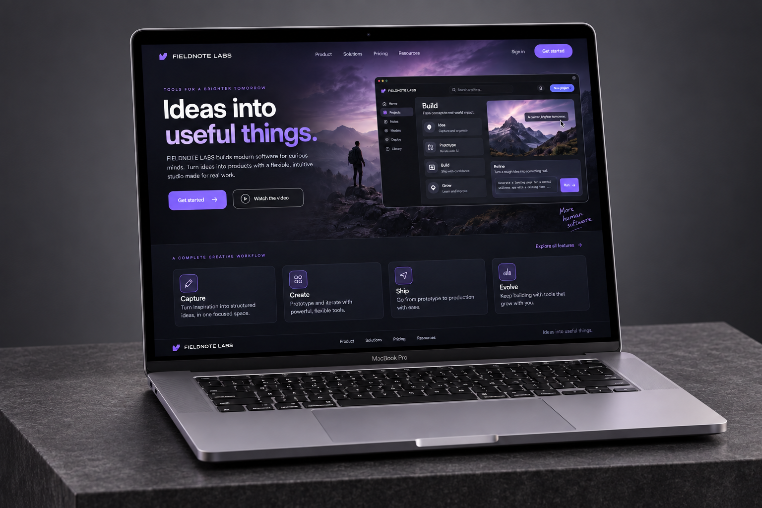
The homepage moves from the problem to the workflow and then to the value of a shared system. Visitors can understand the proposition without reading a specification first.
Technology
Fieldnote Labs needed to turn a technical offer into a clear digital story. We created a custom website that helps visitors understand the product, recognise its value and arrive at a demo with the right questions.
Increase relevant product-demo requests and make technical capabilities easier to understand for business decision-makers.
Lead with the problem the product solves, show how the workflow changes, and make technical detail available at the right depth.
THE BUSINESS
Fieldnote Labs develops software that helps teams turn fragmented project information into a shared working picture. Its audience includes operational leaders, team managers and technical evaluators. The site needed to work for people who wanted a quick explanation as well as those assessing how the product would fit into an existing workflow.
THE CHALLENGE
The previous story began with capabilities before establishing why they mattered. Visitors encountered technical language without a clear view of the everyday problem. Demo enquiries varied widely, and the team spent too much time explaining the basic proposition during introductory calls.
The opportunity was to connect product detail to a recognisable business outcome. A clearer sequence could help people decide whether to explore the solution, review a workflow or book time with the team.
THE APPROACH
We organised the story around the situations that trigger a search for a new tool. The homepage introduces the problem, shows the working experience and explains the next step. Deeper solution pages provide more detail for visitors with specific operational or technical questions.
A near-black and lavender palette, precise typography and carefully framed interface visuals created a focused product experience. Motion was used to explain relationships within the workflow, while concise copy carried the main story even when animation was disabled.
THE EXPERIENCE
Every part of the experience connects a business goal to a clearer next step.
The homepage moves from the problem to the workflow and then to the value of a shared system. Visitors can understand the proposition without reading a specification first.
Pages address distinct team needs and explain relevant capabilities in context. Technical information is available without overwhelming a first-time visitor.
The request path prompts visitors to describe their team and current workflow. Those details help the sales conversation begin with the business problem rather than a generic tour.
Website messaging and the pitch deck use the same narrative structure. That gives the team a coherent way to introduce the product in search, on the site and in a presentation.
THE WEBSITE
The landing page brings the story, services and next step together in one continuous experience. Scroll through the design or open the full-size view.
Explore the full landing page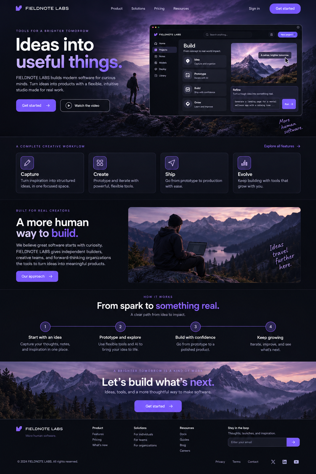
DEVELOPMENT & HANDOVER
We built the site with a custom component system for product explanations, solution pages and interface sequences. Animation was kept separate from essential content, and responsive layouts were checked for readability. The content structure and metadata gave search-facing pages a distinct purpose, while the handover supported future product updates.
THE RESULTS
The revised story attracted more relevant visitors and helped them progress to the demo request. Enquiries included better context, and introductory calls could focus more quickly on fit and implementation questions.
2,500 5,800 per month
50 95 per month
30 51 per month
Monthly baseline compared with the third month after launch. Figures shown use the same channel and event definitions across both periods.
CLIENT PERSPECTIVE
“We are getting more traffic, but more importantly, people now understand the product before the first call. Demo requests have increased and the conversations are much more specific. The new site gives our team a clearer starting point.”
YOUR BUSINESS. YOUR NEXT CHAPTER.
Let’s build