
Menus made for the screen
Menu sections use readable type and clear categories rather than relying on a downloaded file. The layout adapts to narrow screens and supports seasonal updates.
Hospitality
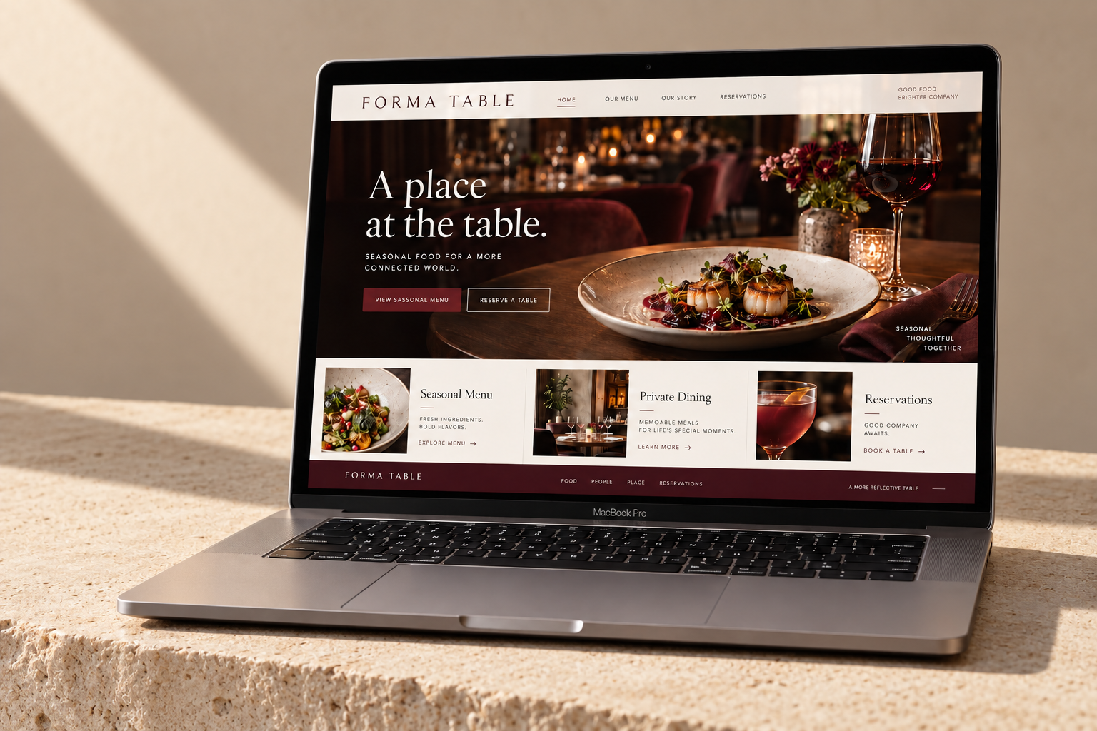
Forma Table’s website needed to do two things beautifully: express the character of the restaurant and make a reservation feel effortless. We brought the menu, the space and the practical details together in one custom experience.
Increase direct reservations and help guests find menus, opening information and private-dining options without friction.
Lead with the dining experience, answer practical questions early, and keep the reservation journey visible throughout the site.
THE BUSINESS
Forma Table is a seasonal dining destination built around generous hospitality, changing ingredients and a carefully considered space. Guests might be planning a quiet dinner, a celebration or a private event. The website had to communicate the atmosphere while remaining useful to someone making a quick decision on a phone.
THE CHALLENGE
The old experience relied heavily on disconnected menu files and social updates. Visitors could see food photography but often struggled to confirm the current menu, opening details or the best way to book. Private-dining enquiries were mixed in with general messages.
The redesign needed to turn those separate pieces into a complete guest journey. The visual experience should create interest, while menu and reservation information should remain immediate and dependable.
THE APPROACH
We organised the homepage around the way guests plan: discover the restaurant, explore the food, check the details and reserve. Private dining was given a distinct pathway with room for event context, while practical visit information was surfaced in the navigation and closing sections.
A rich oxblood palette, warm cream surfaces and expressive serif typography reflected the restaurant’s atmosphere. Food and interior imagery were balanced with readable menu layouts. The design feels editorial, but the reservation action remains direct and consistent.
THE EXPERIENCE
Every part of the experience connects a business goal to a clearer next step.
Menu sections use readable type and clear categories rather than relying on a downloaded file. The layout adapts to narrow screens and supports seasonal updates.
Booking calls to action appear at natural decision points, including after menu and visit information. The interface avoids burying reservations beneath decorative content.
The event section introduces the setting and prompts visitors to share occasion, group size and preferred timing. It helps separate a potential event from a general question.
Location, contact options and visit details are easy to find. Descriptive page content supports people discovering the restaurant through local search.
THE WEBSITE
The landing page brings the story, services and next step together in one continuous experience. Scroll through the design or open the full-size view.
Explore the full landing page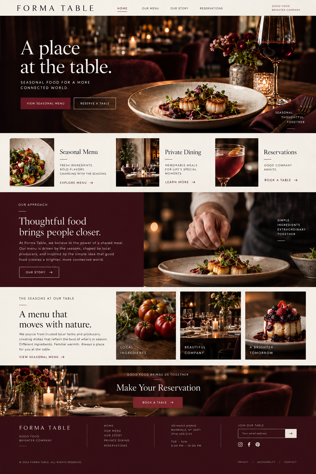
DEVELOPMENT & HANDOVER
The site was developed from scratch with a flexible content structure for seasonal menus and hospitality information. Photography was sized for the layout, navigation was tested on small screens, and the reservation route was kept consistent across the experience. The handover focused on making routine menu and information updates straightforward.
THE RESULTS
More guests moved directly from exploring the restaurant to making a reservation. Phone calls became more focused, with fewer routine questions about where to find menus and more conversations about bookings and private events.
3,000 6,300 per month
200 328 per month
40 58 per month
Monthly baseline compared with the third month after launch. Figures shown use the same channel and event definitions across both periods.
CLIENT PERSPECTIVE
“Guests tell us they booked after seeing the menu and getting a feel for the room. We have more direct reservations, more traffic and more useful calls about events. The website feels like the first part of the evening.”
YOUR BUSINESS. YOUR NEXT CHAPTER.
Let’s build