
Classes that are easier to choose
Class pages explain the focus, typical session structure and who each format suits. Visitors can compare options without decoding internal programme names.
Fitness & community
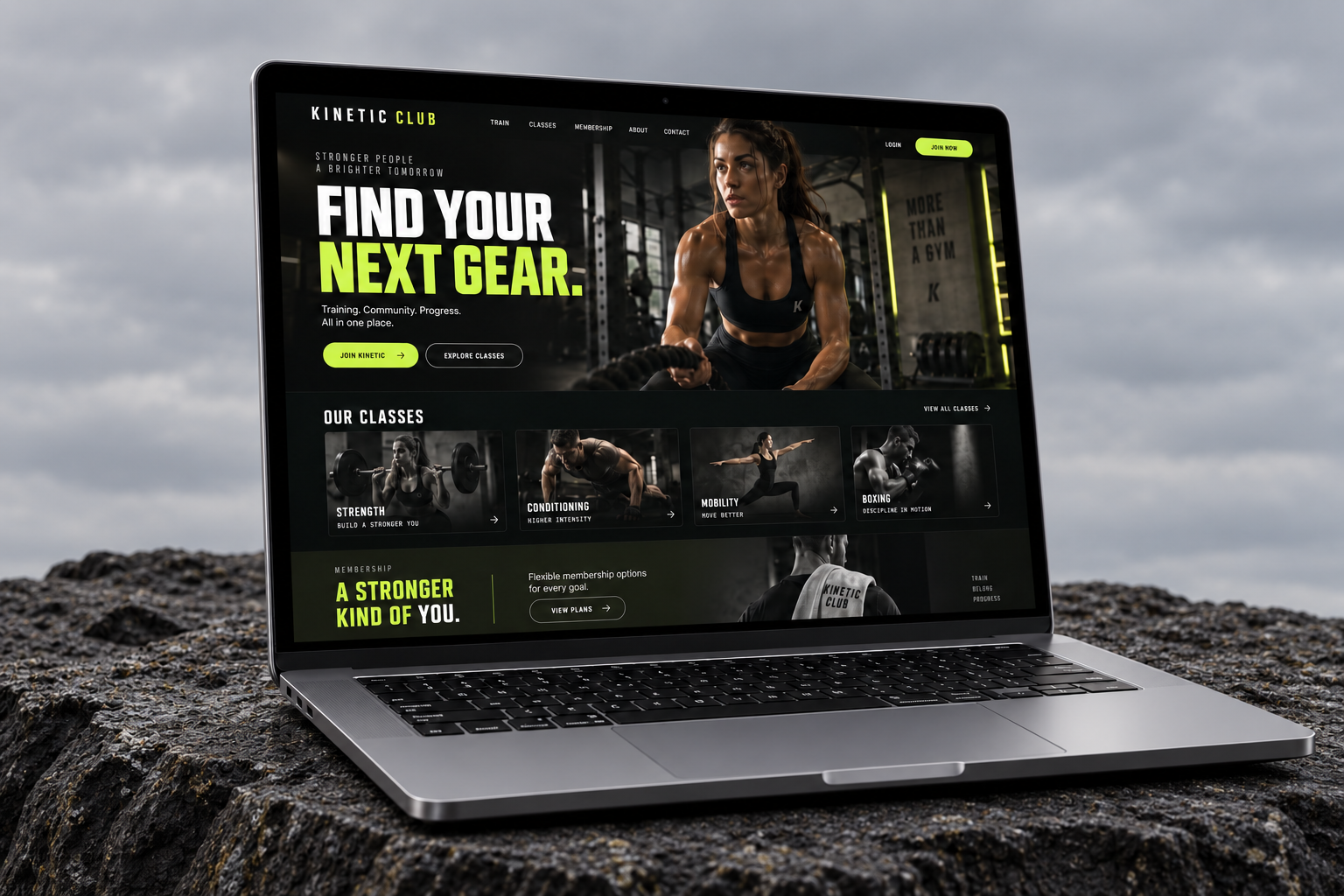
Kinetic Club needed a digital experience with the same energy as its training floor. We created a bold, custom-built website that makes classes, memberships and trial sessions easy to understand—and even easier to find on a phone.
Increase trial-session bookings and help prospective members find a training format that fits their goals.
Bring the atmosphere of the club to the first screen, then remove uncertainty around schedules, membership options and getting started.
THE BUSINESS
Kinetic Club brings together coached strength sessions, small-group training and a community-driven approach to fitness. People arrive with different levels of experience, from complete beginners to established athletes. The website had to feel ambitious without making newcomers feel out of place.
THE CHALLENGE
Visitors were interested in the club but struggled to compare classes and understand the membership options. Information about the first session was easy to miss, and the path from a mobile search to a trial enquiry involved too many decisions.
The challenge was to balance personality with clarity. The club wanted a high-energy presence, but visitors still needed practical answers: what should I book, what should I expect, and how do I get started?
THE APPROACH
We mapped the new-member journey from discovery to arrival. Class information was grouped by goals and experience, membership choices were described in plain language, and the trial-session route was given a consistent place throughout the website.
A near-black foundation, sharp lime accents and confident typography translated the club’s energy into a clear visual system. Training photography carried the human story. Movement was used selectively to guide attention, with reduced-motion support and readable content taking priority.
THE EXPERIENCE
Every part of the experience connects a business goal to a clearer next step.
Class pages explain the focus, typical session structure and who each format suits. Visitors can compare options without decoding internal programme names.
A structured membership section makes the differences between plans easy to scan. The emphasis is on training needs and flexibility, with a clear route to ask a question.
The trial page covers arrival, equipment and what to expect. A focused call to action connects the practical information to the next step.
Large touch targets, a compact menu and readable schedules support visitors comparing classes on the move. Important contact details stay easy to reach.
THE WEBSITE
The landing page brings the story, services and next step together in one continuous experience. Scroll through the design or open the full-size view.
Explore the full landing page ↗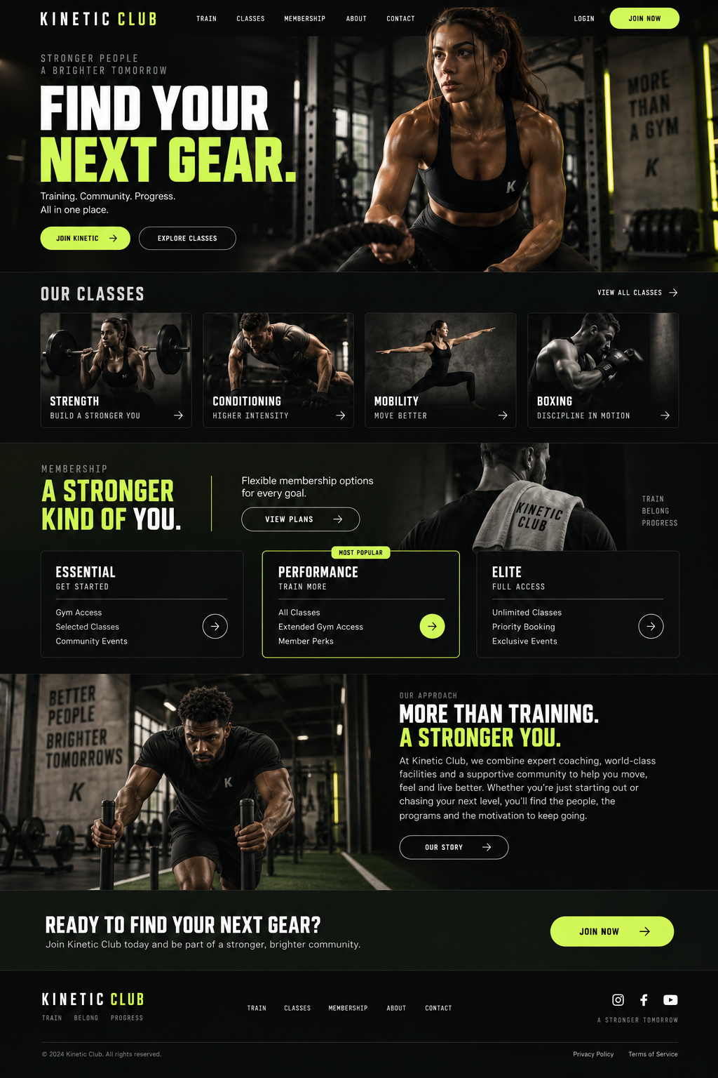
DEVELOPMENT & HANDOVER
The website was built around reusable custom components for class information, memberships and training content. We tested the hierarchy at narrow widths, reduced unnecessary interface steps and kept the animation lightweight. The measurement plan separated visits, trial enquiries and membership enquiries so each stage could be reviewed independently.
THE RESULTS
More visitors reached the trial-session page, and a higher share took the next step. The team also spent less time answering basic questions about what a first visit involved, leaving more time for meaningful conversations about training goals.
2,500 → 4,900 per month
40 → 88 per month
30 → 48 per month
Monthly baseline compared with the third month after launch. Figures shown use the same channel and event definitions across both periods.
CLIENT PERSPECTIVE
“The site captures the club’s energy without making people work to find a class. We have more trial enquiries coming through and more calls from people who are ready to get started. It feels like part of the club now.”
YOUR BUSINESS. YOUR NEXT CHAPTER.
Let’s build