
Service pathways built around real questions
Pages address planning, operations and growth in language a business owner can recognise. Related services are introduced where they are relevant rather than presented as a long menu.
Professional services
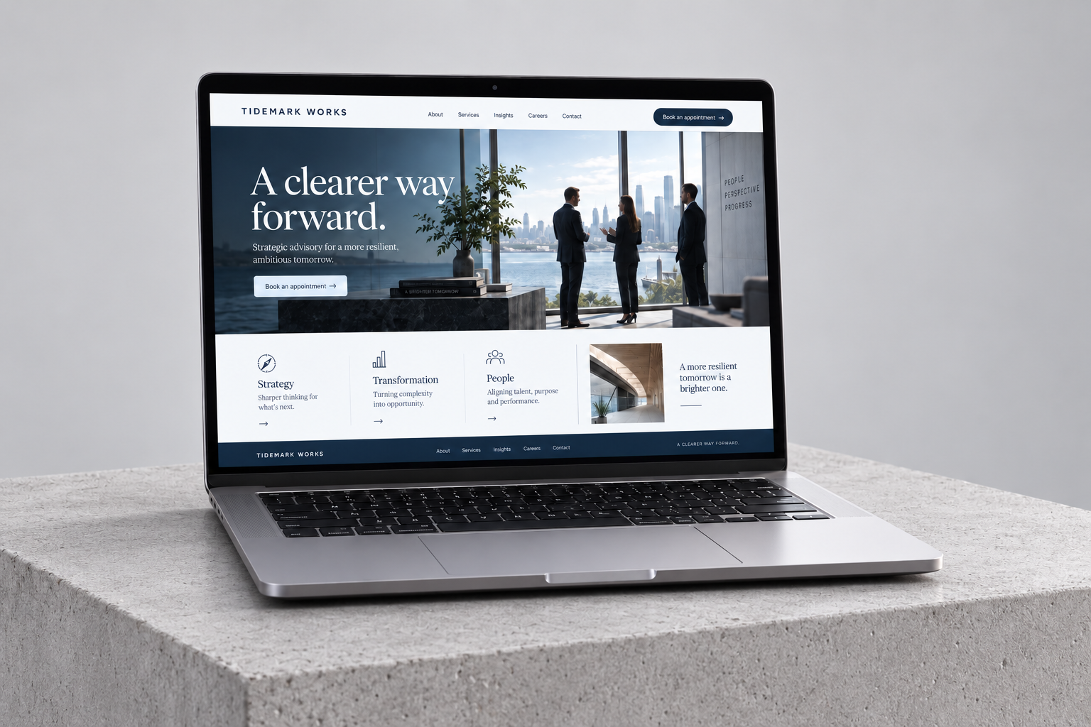
Tidemark Works needed a website that made a complex service offering feel approachable. We created a custom digital presence that connects clear service information, practical guidance and a more organised client journey.
Increase relevant consultation requests and reduce friction in the path from an initial enquiry to a working relationship.
Organise services around the questions business owners ask, then connect those answers to a simple consultation route and a considered customer workspace.
THE BUSINESS
Tidemark Works is an independent advisory practice supporting business owners through planning, operational change and growth decisions. Its work depends on trust and a shared understanding of the problem. The website needed to show both the expertise available and what it is like to work with the team.
THE CHALLENGE
The service offering had become difficult to navigate. Long descriptions used internal terminology, and prospective clients often called without knowing which service was relevant. The website did not explain the engagement process or help people prepare for an initial conversation.
At the same time, the team wanted a more coherent digital experience for existing clients. Enquiries, project information and document-sharing expectations needed to be treated as connected parts of the customer journey.
THE APPROACH
We grouped the service offering around business situations rather than department names. Each pathway explains the problem, the kind of support available and the next step. The consultation brief focuses on useful context, while the portal concept separates public information from client-specific work.
Deep navy, pale blue and a precise editorial grid communicated confidence without feeling impersonal. Headlines became shorter, diagrams and supporting content were given clear roles, and the page hierarchy moved from the visitor’s question to the relevant service.
THE EXPERIENCE
Every part of the experience connects a business goal to a clearer next step.
Pages address planning, operations and growth in language a business owner can recognise. Related services are introduced where they are relevant rather than presented as a long menu.
The enquiry journey asks for business context, the decision ahead and the kind of support required. That gives the team a stronger basis for preparing an initial call.
The portal design organises project updates, shared documents and next actions. Access boundaries and document handling are part of the planning from the outset.
Reusable service and insight layouts let the practice add useful guidance while maintaining a consistent experience. Each page has a clear purpose and an appropriate next step.
THE WEBSITE
The landing page brings the story, services and next step together in one continuous experience. Scroll through the design or open the full-size view.
Explore the full landing page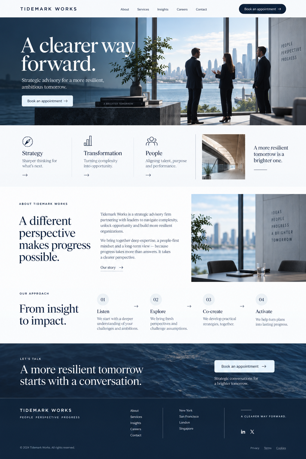
DEVELOPMENT & HANDOVER
We translated the information architecture into a custom website and defined the data relationships behind the proposed client workspace. The development approach separated public content from private interactions, with validation and access control considered in the technical plan. Responsive layouts kept dense service information readable on smaller screens.
THE RESULTS
More visitors reached the consultation route, and the quality of initial conversations improved. Prospective clients could identify the support they needed before calling, while the team had clearer context for following up.
1,000 1,880 per month
32 56 per month
24 36 per month
Monthly baseline compared with the third month after launch. Figures shown use the same channel and event definitions across both periods.
CLIENT PERSPECTIVE
“People now call us knowing which service they need and why. The increase in traffic is valuable, but the real difference is the quality of those conversations. The website makes it much easier to take the first step with us.”
YOUR BUSINESS. YOUR NEXT CHAPTER.
Let’s build